Lead design operations across Pure Health's digital product while building and managing a comprehensive design system, from component creation and documentation through to implementation across design and development, ensuring consistent, scalable experiences throughout Pura.
- Project
- Design System
- Role
- Product & Design System Manager
- Industry
- Healthcare
Challenge
Pura's design language has to hold across four consumers that share no code: the Figma library it is defined in, a documentation site, an iOS app and an Android app. Nothing forces those four to agree. A token renamed in Figma, a component built a little differently on one platform, an icon shipped under the wrong name: none of it breaks a build, and none of it surfaces until someone notices a screen looks wrong. The hard part was never drawing the components. It was the connective tissue that keeps four independent implementations honest.
Results
I own the system end to end: 394 tokens and 206 component sets defined in Figma, implemented natively on iOS and Android, and documented as a versioned, schema-validated contract rather than a static site. Every component doc records the Figma file and node it was derived from and the date it was derived, so staleness is measurable instead of assumed. Automated audits catch what review misses, and report gaps back to design with the usage counts attached.
- Design tokens*
- 394
- Component sets
- 206
- Component usage
- 100%
- Platforms
- 3
- Languages, full RTL
- 2
- 90
- Primitive
- 98
- Semantic
- 86
- Component
- 95
- Typography
- 25
- Layout
Nothing in the system points at a raw value directly. A component reads a semantic token, the semantic token resolves to a primitive, and that indirection is what lets a value change in one place and land everywhere.
Colors
Six hue ramps, plus black and white held as alpha rather than flat greys, so a scrim or a divider composites over whatever sits behind it instead of fighting it.
Typography
Twenty styles across four tiers, on two typefaces with one weight each, except Body which carries both Medium and SemiBold. Every size is specified against Figma's 440pt frame and scales down proportionally on a narrower phone, so a label keeps the proportion it was drawn at rather than truncating.
Spacing, radius and borders
Spacing, radius and border weight are not three scales. They are three semantic namings of the same eleven numbers, so a rung can be re-tuned once and land in all three, and a value that wants to sit between two rungs has to justify itself rather than just appear.
| Unit | Value | Spacing | Radius | Border weight |
|---|---|---|---|---|
| 00 | 0 | · | none | · |
| 01 | 1 | · | · | default |
| 02 | 2 | xxs | · | strong |
| 03 | 4 | xs | xs | · |
| 04 | 8 | sm | sm | · |
| 05 | 16 | md | md | · |
| 05-5 | 20 | base | · | · |
| 06 | 24 | lg | lg | · |
| 07 | 32 | xlclearance-side | xlg | · |
| 08 | 40 | xxl | · | · |
| 09 | 48 | xxxl | · | · |
Four tokens sit off the ramp. One earns it; three are the system leaking.
- radius/full999
- Deliberate. A pill is not a radius on a scale. It is an instruction to round completely, and no rung can express that.
- border-weight/medium1.5
- Falls between 01 and 02. A hairline-and-a-half that was easier to type than to argue for a new rung.
- spacing/clearance-top78
- Measured off a specific header rather than chosen from the scale.
- spacing/clearance-bottom50
- Same, for the tab bar. Both are real measurements that should resolve to a rung or become their own named layout tokens.
Figma is the source of truth. Its variables are synced into a versioned token repository in W3C Design Tokens format, and that repository is what every platform builds against.
- Source of truthFigma
Ten variable collections, 394 variables. Color carries Light and Dark modes; everything else is single-mode.
- Synced as a delta
- Versioned sourcepura-design-tokens
Its own repository, seven files, 650 tokens in W3C Design Tokens format. Semantic tokens alias primitives rather than restating them, so a ramp changes in one place.
- Built against by
- DocumentationGeneratedWeb
The build resolves the token source into 595 CSS custom properties before Next.js compiles. Components depend on the stylesheet, not the tokens, so the UI package can be lifted out and installed by another team.
SwiftUIImplemented nativelyiOSThe token files are vendored into PuraTheme and implemented as xcasset colorsets and Swift enums, named to match so any value can be traced back to the token it came from.
ComposeImplemented nativelyAndroidKotlin objects in core/ui/theme, reached through a CompositionLocal so a composable reads a semantic name and never a hex value.
What a contract is
A contract is a component's documentation written as data instead of prose. One file per component, saying what it is called, what choices it offers, which token each part uses under each of those choices, what it looks like inside, when to use it, and what is currently wrong with it.
Because it is structured data with a schema behind it, a program can read it. The documentation site builds its pages from that file. The audits read the same file to compare the component against Figma. Nothing anywhere keeps a second copy.
Purpose of a contract
Most design systems document a component by writing a page about it. The trouble with a page is that nothing can check it. Rename a token, change a variant in Figma, and the page still reads perfectly well while being wrong. Nobody finds out until someone builds from it.
A contract fails instead. A token that no longer resolves stops the build. A doc that has not been re-read since its component moved says so, with a date. The point was never tidier documentation. It was documentation a computer can check and reuse, so that staying current stops depending on somebody remembering to.
How a contract gets made
Read the component in Figma
Open the real component set and go through it variant by variant, noting which variable is bound to each part. The file, the node and the date all get written down, so there is never a question later about which version of the component the doc was describing. Button's says node 2055:1663, read on 12 August 2026.
Write the doc file
One file per component, holding the description, the choices it offers, the props a developer passes, the token behind each part, the anatomy drawing and the known problems. This is the only step a person actually writes, and it is deliberately the only one.
Let the build check it
Every build validates that file against a schema and turns it into JSON. A missing field, a malformed variant or a token that does not resolve stops the build. A doc cannot be published in a shape the schema does not allow, which is what makes the rest of it trustworthy.
Everything reads the same file
The site renders its pages from that JSON, and the audits read it to compare the doc against Figma. Because there is only ever one copy, there is nothing for the two to disagree about.
What is inside one
Every field answers a question someone would otherwise have to walk over and ask a designer.
- name, section, category
- What the component is called, and where it sits in the library.
- keywords
- The words someone might search for it by, including the ones that are not its name. Button answers to cta, fab and trigger as well as to button.
- figma
- The file and node it was read from, and the date it was read. This is what makes staleness a fact you can look up rather than a worry.
- usage
- What it is for in a sentence, then the things to do and the things to avoid, written as guidance a person can disagree with rather than rules they cannot.
- axes
- The choices the component offers. Button has four: configuration, variant, size and state. Two configurations by four variants by three sizes by three states is the 72 combinations it has to be documented for.
- props
- What a developer actually passes in code, so the doc describes the real API rather than an idea of it.
- tokens
- Which token each part uses, for every combination of choices. Button has fourteen parts across those 72 combinations, so writing it out longhand is roughly a thousand entries. A generator collapses it to the 50 rules that actually decide anything, and can be run again to check itself against what the doc claims.
- diagrams, layout
- The anatomy drawing, the labels on it, and how the pieces are arranged.
- issues
- What is wrong with the component or its documentation right now, each with an id so it can be tracked and closed rather than rediscovered. Button currently carries two.
What the documentation is
The documentation is a web application, not a page of screenshots. It rebuilds itself from the same sources the products build from: the token repository and the component contracts.
Starting it regenerates 595 CSS custom properties, the component registry and the component stylesheets before the site compiles. A value that changes at source changes on the site without anyone opening a page to edit it, which means the documentation cannot quietly fall behind the thing it documents.
The components are real
Every component is documented with a working implementation on the page rather than a picture of one. You see the real thing in every variant, not a render of it from the week it was drawn.
They are deliberately self-contained. A component file imports nothing from the rest of the site, and its only dependency is the generated stylesheet, which is what lets the whole set be lifted out as a package another team installs: they take the files and one stylesheet, and nothing else comes with them. The rule that keeps it that way is stated in the files themselves. Every value is a token reference, and a literal in a component file means the token is missing and belongs at source.
What it covers
The parts a design system is usually judged on are here, and so are the parts that usually live somewhere else entirely.
- Components
- Each with a live implementation, every variant, the token behind each part, and the Figma node it was derived from.
- Foundations
- Colour, typography, layout, iconography, accessibility, experience principles, and release notes recording what changed and when.
- Content design
- Tone of voice, grammar and mechanics, a messaging framework, an editorial checklist, UX and UI glossaries, cultural awareness and translation guidance. The written half of the system, which most design systems leave to a different team and a different document that nobody can find.
- Motion
- Loading, navigation transitions, the agent's thinking state, the card set, the celebration coin. Each one plays on its page, because a paragraph describing an animation is not documentation of it.
- Resources
- A content strategy summary, the editorial style guide, the glossary and keyword sheet, the editorial checklist and the logo pack, for the people who need the system without ever opening Figma.
Watching for drift
A contract states what a component is supposed to be. The two apps are what it actually became. The first half of governance is the machinery that puts those side by side and writes down where they differ, plus the discipline of publishing the difference rather than quietly closing it.
A conformance check, run on Button
The contract is served as JSON with every token key already resolved, so a platform can be held against what the component is supposed to be rather than against a screenshot of it. Button is the hardest case in the library: four axes, 72 combinations, fourteen parts. Reading the same values out of the contract, the Swift and the Kotlin gives this.
| Checked | Contractnode 2055:1663 | iOSPuraButton.swift | AndroidPuraButton.kt |
|---|---|---|---|
| Variants | 4 | 4 matches | 3 under 4 names differs |
| Sizes | 3 | 4 differs | 3, none reachable differs |
| Heights, large to small | 56 / 40 / 32 | 56 / 40 / 32 matches | 56 / 40 / 32 matches |
| Inline padding, medium | 16 | 16 matches | 18 differs |
| Corner radius | radius/full | Capsule matches | 48% differs |
| Width bounds | 80 to 400 | 80 to 400 matches | unset differs |
| Icon button | an axis on Button | the same axis matches | 4 components differs |
Design system ops
Drift is not only a machine problem. A component can be used wrongly without anything being renamed or mistyped, and no audit catches a designer who detached an instance and nudged it. The other half of governance is a set of review points at fixed moments in a feature's life, each checking the work against a written standard rather than an opinion. The system's conventions live in a guidelines document covering token descriptions, which token group to use when, component naming and text style usage, so a review is a comparison rather than a negotiation.
Before anything is drawn
Start from what the system already covers. Most components that feel new are an existing one with a different label or an extra slot, and the cheapest moment to find that out is before a file exists. It is also where a genuine gap gets spotted early enough to be built properly rather than worked around.
While the design is being made
Watch for the things that look correct and are not connected to anything: detached instances, local styles, colours and spacing typed in by hand instead of taken from a token. None of it shows up in a screenshot, and all of it is expensive once it reaches a build.
When something really is missing
A gap becomes a request against the system rather than a one-off built inside a feature file. The distinction matters more than it sounds. A one-off is a component nobody owns, that no audit knows about, and that quietly becomes a second version of something the system already has.
Before handoff to engineering
A review of the file against the system before the work leaves design. The question is not whether the screen looks right. It is whether every part of it is the component it appears to be, used the way that component is meant to be used.
In the pull request
The same check from the other side: hardcoded colours and spacing, a component rebuilt locally because reaching the real one was slightly awkward. Catching it here is what keeps the implementation on the system rather than near it.
Most people only look when something is already wrong
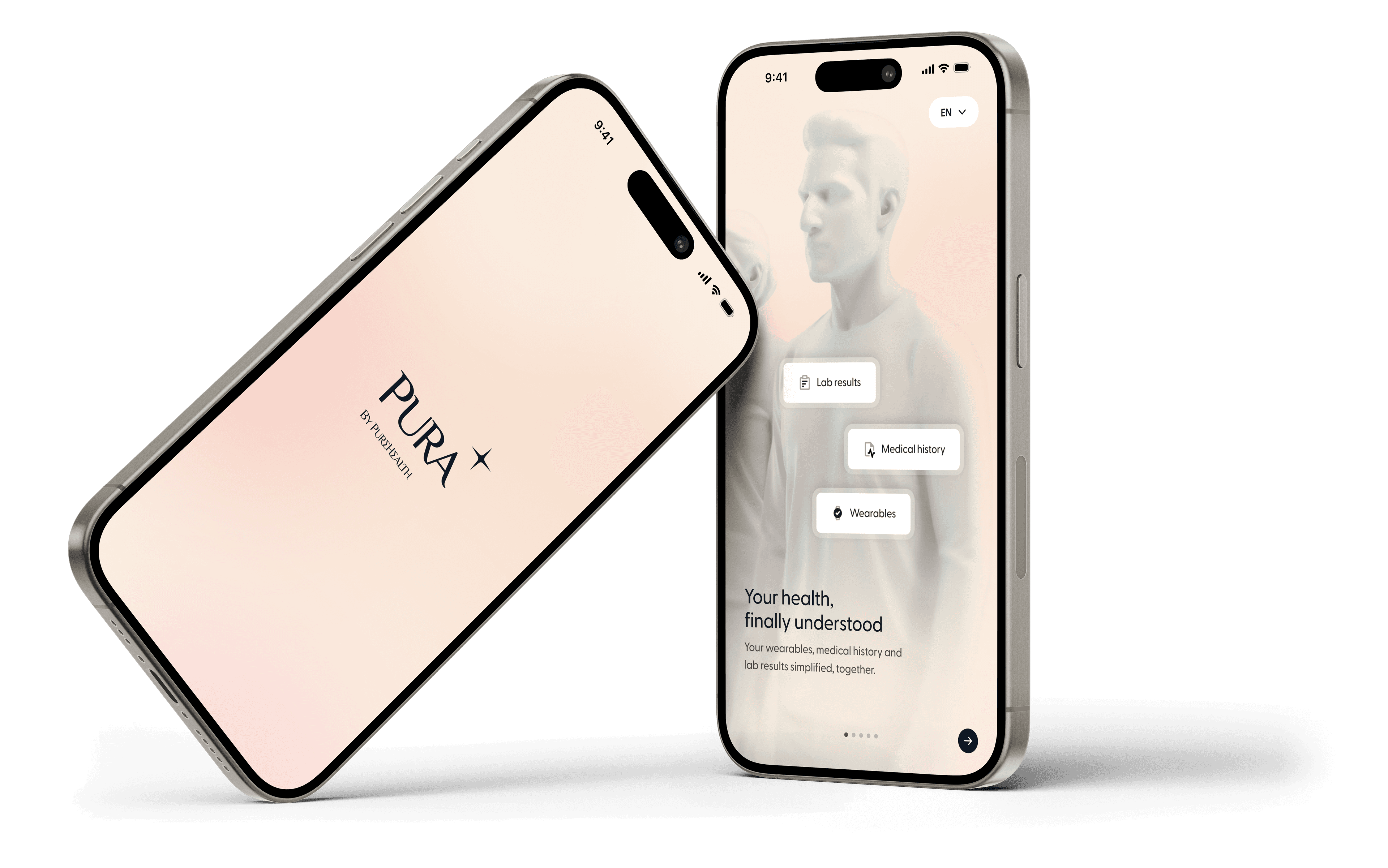
By the time a symptom sends you to a doctor, the interesting part of the story happened months earlier, in numbers nobody was looking at. And those numbers are scattered: a blood panel in one portal, a watch on your wrist, a prescription in a paper bag, an appointment booked by phone. Nothing joins up, so nothing adds up to a picture you can act on.
Pura is the argument that it does not have to work this way. It cannot assume you arrive with a full blood panel, or a wearable, or any history at all. It has to be useful on day one with almost nothing, get sharper as your data arrives, and never show you a confident picture it has not earned.
Connective health
Healthcare shouldn't feel like a maze of platforms, jargon, and disconnected steps. Three sources normally live in three different places, owned by three different systems, and you are left to be the integration layer between them.
Your lab results, your wearable and your own profile all resolve into the same model. Bloods are uploaded, read and turned into biomarkers. A watch streams into a normalised pipeline that speaks one vocabulary whatever device it came from. None of it is shown as three separate feeds, because the value is not in having the data. It is in the data agreeing on one answer.
Preventative, not reactive
Meeting people in the moments and channels that matter. You do not open a health app to be told you are fine. Something has to be paying attention on your behalf, or prevention is just a word.
The agent sits across all of it: your wearable, your last lab result, your last conversation, your last appointment. It knows what normal looks like for you, so it can tell a real shift from one bad night, and it only speaks when there is something worth saying. Then it picks its moment, whether that is a push, a card on your home screen, a note where it applies in the app, or raising it in conversation.
That is the difference between a product you remember to check and one that checks on you.

Your PureScore, on your digital twin
A 0-100 score reflecting your overall health and lifestyle. One number, because a page of biomarker names is not something anyone acts on.
It is built from what is already connected: your bloods, your wearable, your profile. Each pillar carries its own markers, cardiovascular through respiratory, metabolic, renal and liver, and those roll up into the score. Nothing is invented for it. The score is the same data, resolved.
Then it is drawn onto a digital twin. Each system is tinted by where it sits on a five-step ramp, from critical through moderate and mild risk to good and great, so you can see which part of you is asking for attention without knowing what a single marker is called.
Easy access to care
Appointments to book, labs to visit, daily medications to take. Telling you something has shifted is the easy part. Acting on it is where most health apps stop, and the phone calls and portals begin.
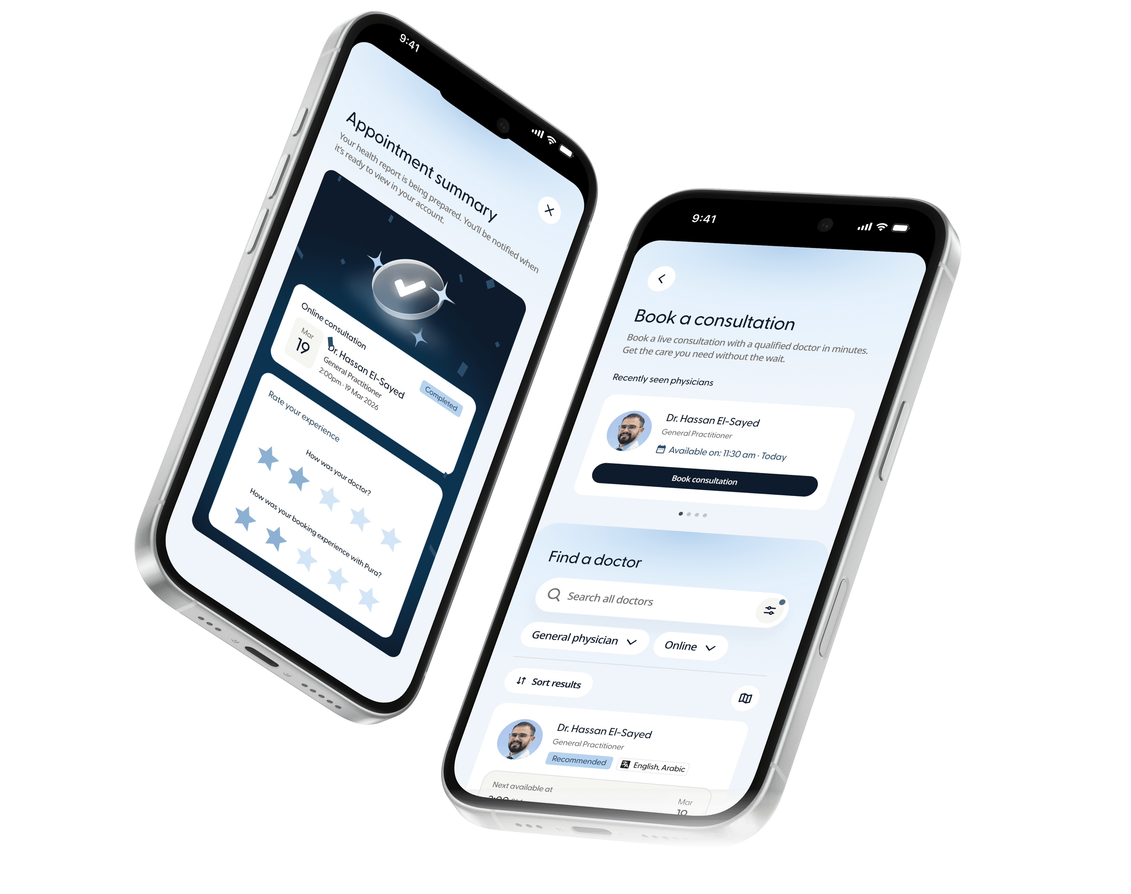
Everything that follows lives in the same app: finding a doctor by what is wrong rather than by guessing at a speciality, seeing them in person or on video, and ordering your prescriptions.
None of that is measured in features. It is measured in how few steps sit between noticing something and doing something about it.
Conclusion
Healthcare has always asked you to notice first. Pura moves that job to the product: your labs, your wearable and your history resolving into one score, an agent watching it for you, and care in the same place as the thing that prompted it. The measure was never how much it could show you. It was how early it could tell you, and how little stood between knowing and doing.