I focused on research and creating intuitive, user-friendly designs to enhance the customer experience. By analyzing data on insurance products predominantly purchased in-branch or through other channels, we identified key opportunities and successfully launched new products on Nedbank's mobile app.
- Project
- Nedbank Insurance
- Role
- UX designer
- Industry
- Banking/Insurance
Challenge
During the COVID-19 pandemic, customers were unable to visit branches to apply for insurance products, creating a significant barrier to access. This required a seamless digital solution to ensure customers could explore and purchase insurance without in-person interactions.
Results
By analyzing data on insurance products predominantly purchased in-branch or through other channels, we identified key opportunities and successfully launched new products on Nedbank's mobile app.
- New products launched
- 3
UX Artefacts
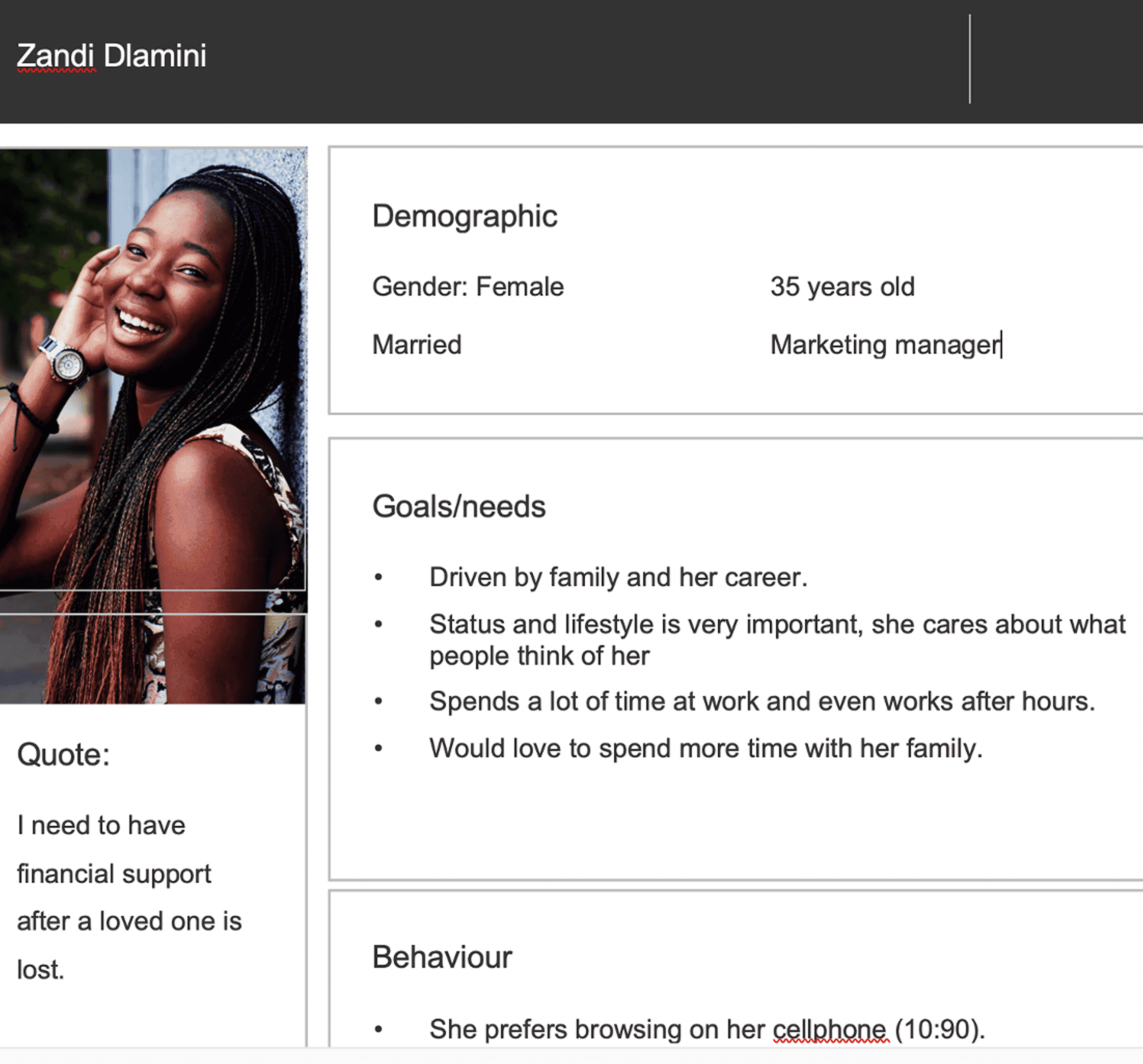
Personas
Before any designs were done, I completed a competitor analysis to understand how our competitors were offering this product to their customers. Gaining these essential insights allowed us to shape our journey and fill in any gaps in the market.
User journeys
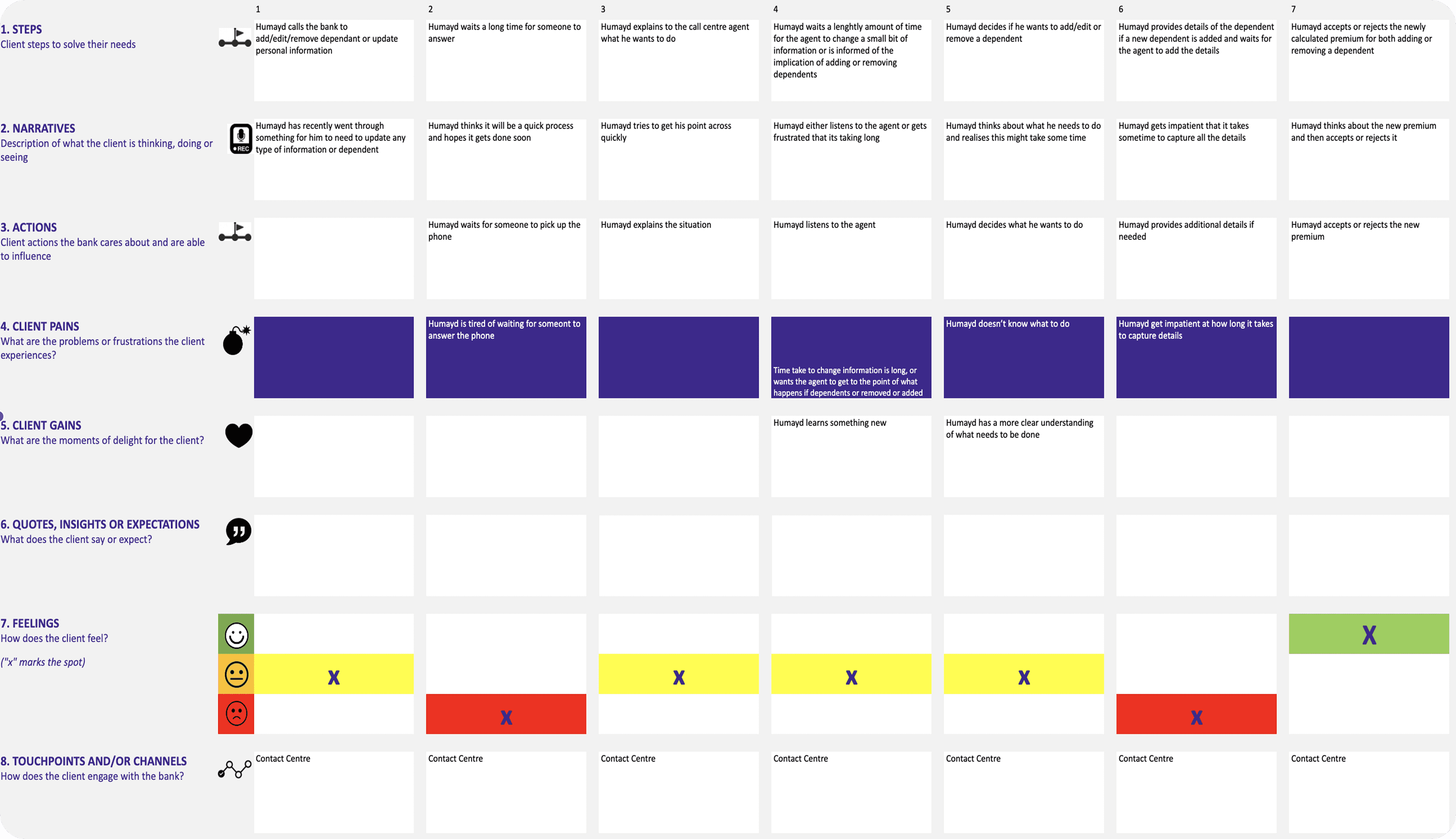
I mapped out the user journey to gain a clearer understanding of the current process. By walking the team through it, we ensured a shared understanding, allowing us to brainstorm ideas collaboratively. This helped us identify customer pain points and uncover opportunities to improve their experience by digitizing the process.
Wireframes & Usability testing
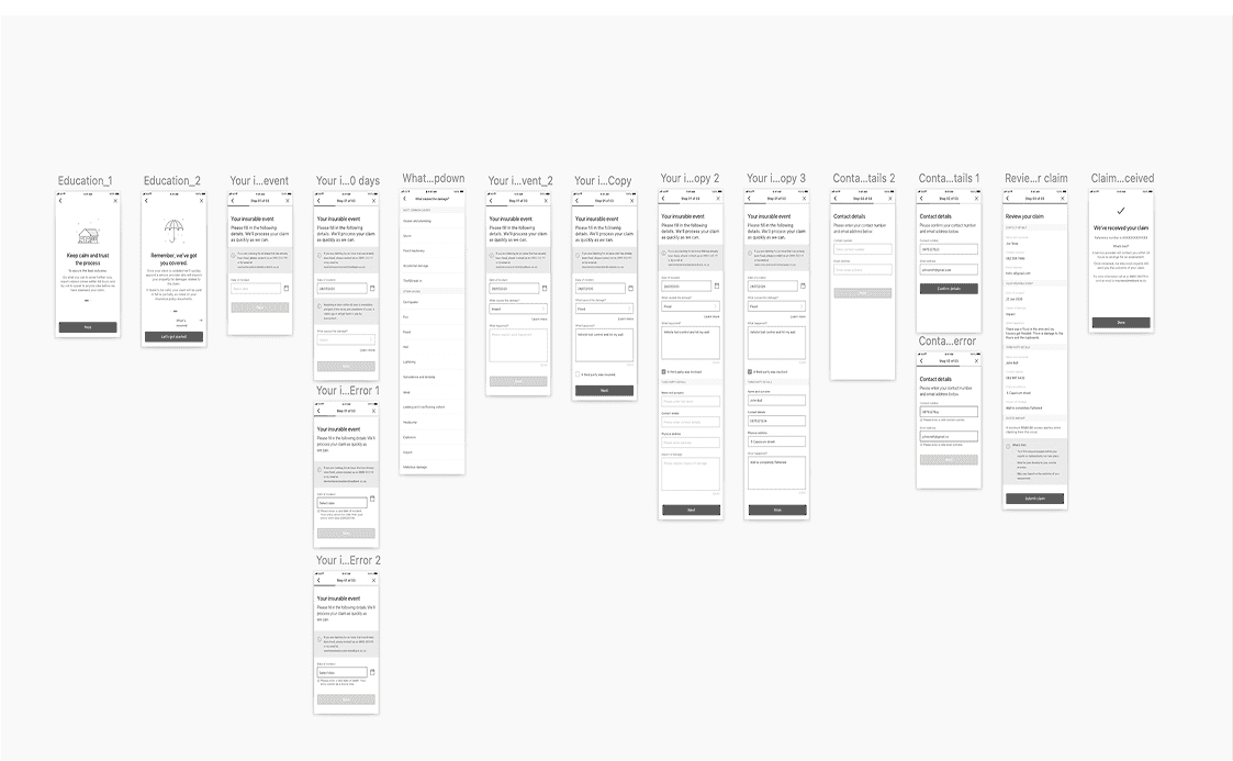
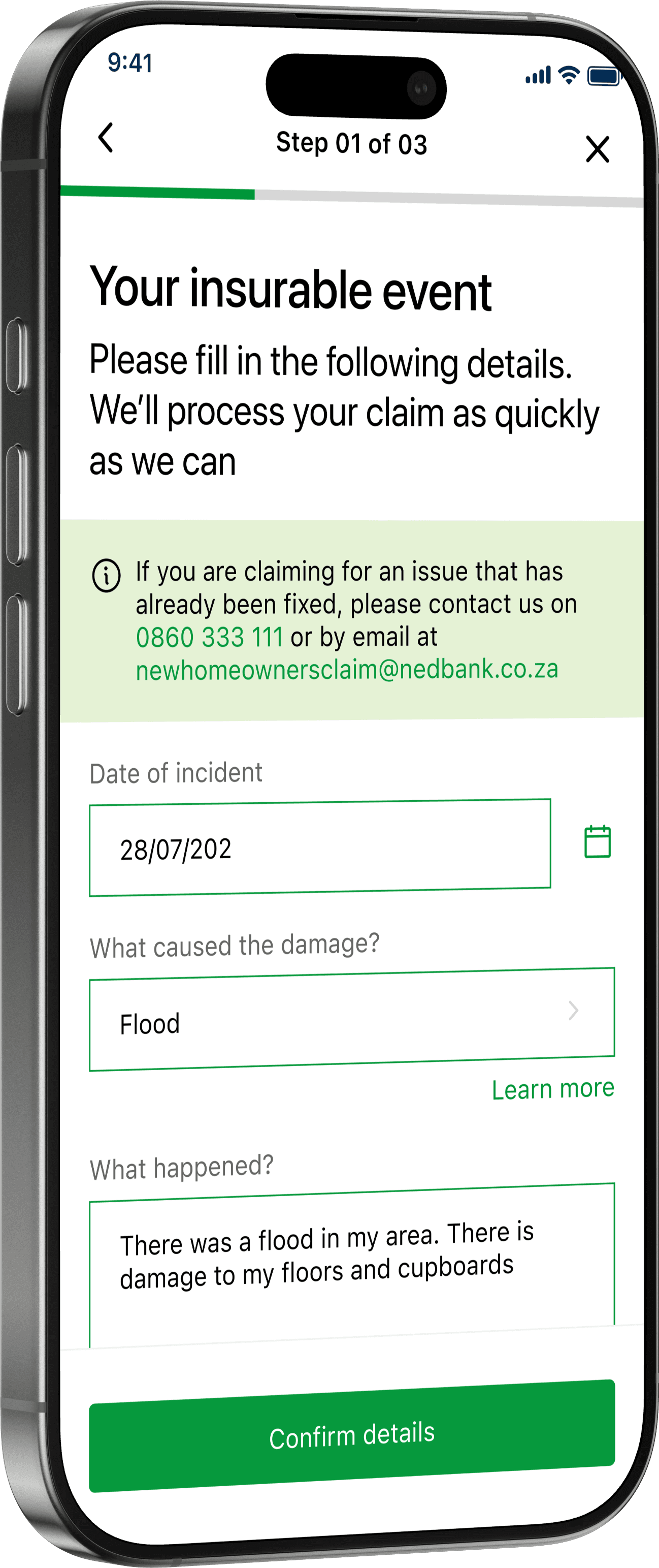
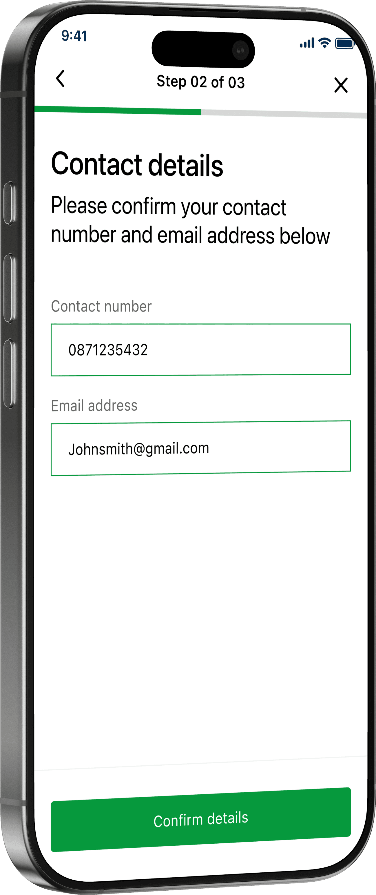
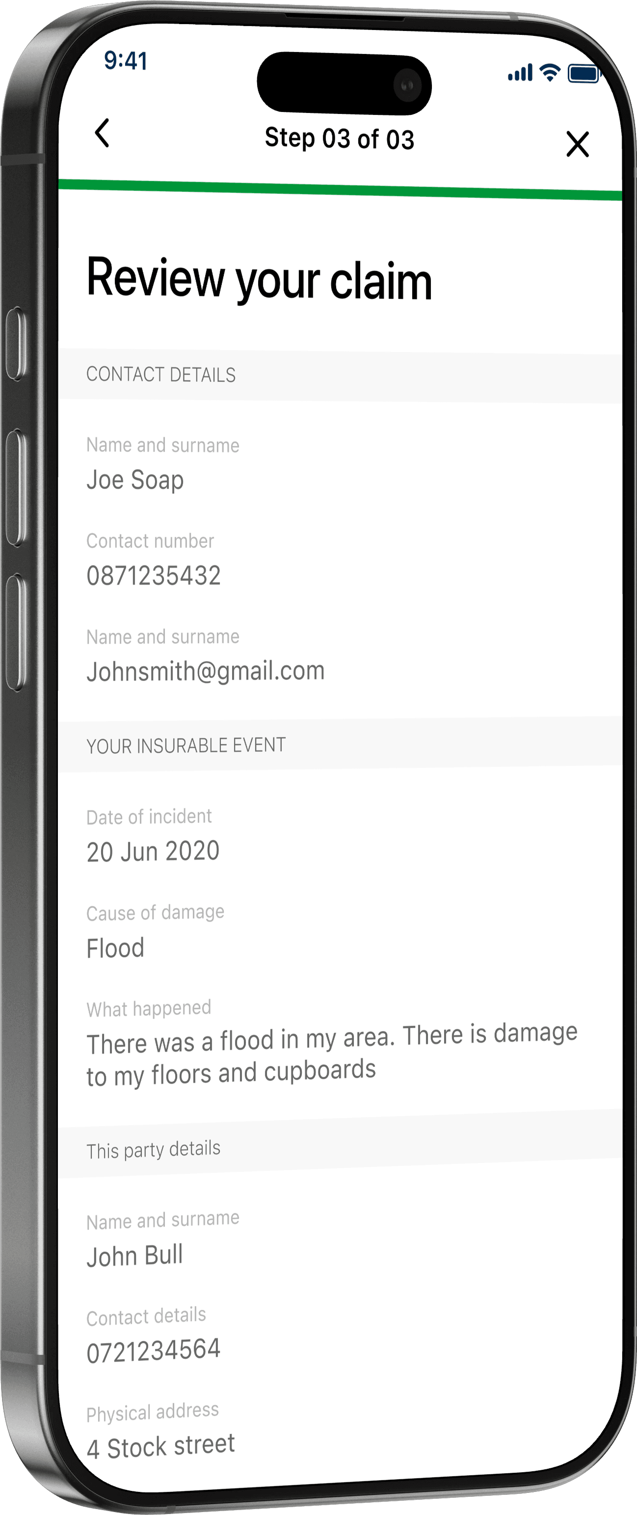
After doing research, I created wireframes for testing to help the client visualize our approach. Using Sketch, I designed low-fidelity wireframes that served as a foundation for collaboration. Feedback from both users and the business was integral to our process, ensuring we crafted the best possible experience.
Conclusion
We launched three new insurance products, giving customers a way to take out cover entirely digitally for the first time. The client was extremely satisfied with the work produced. This project highlighted the importance of being customer-centric and understanding the user experience, particularly after a traumatic event, when users need to claim benefits from their policy.