I led the Personal Finance, Takaful Insurance, Children accounts and Design System value streams, focused on enhancing existing and new customer journeys to improve usability and drive business growth.
- Project
- Takaful Insurance
- Role
- Senior product designer
- Industry
- Banking / Insurance
Challenge
Customers seeking Takaful (Islamic insurance) products faced a lack of accessible and streamlined journeys, hindering their ability to secure essential coverage for various needs such as health, education, and vehicles.
Results
Designed comprehensive journeys enabling customers to easily access and take out Takaful products. This included Card Takaful, Male/Female Takaful, School Fee Takaful, Personal Accident Takaful, Motor Takaful, Home content Takaful and Personal Finance Takaful, providing a seamless and customer-centric experience.
- Total sales increase
- 650%
- New products
- 8
- Reduction in operational workload
- 65%
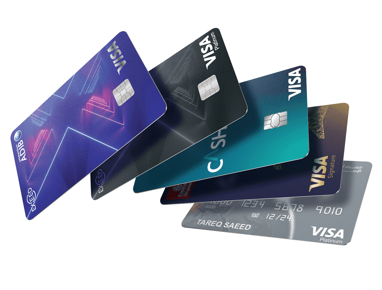
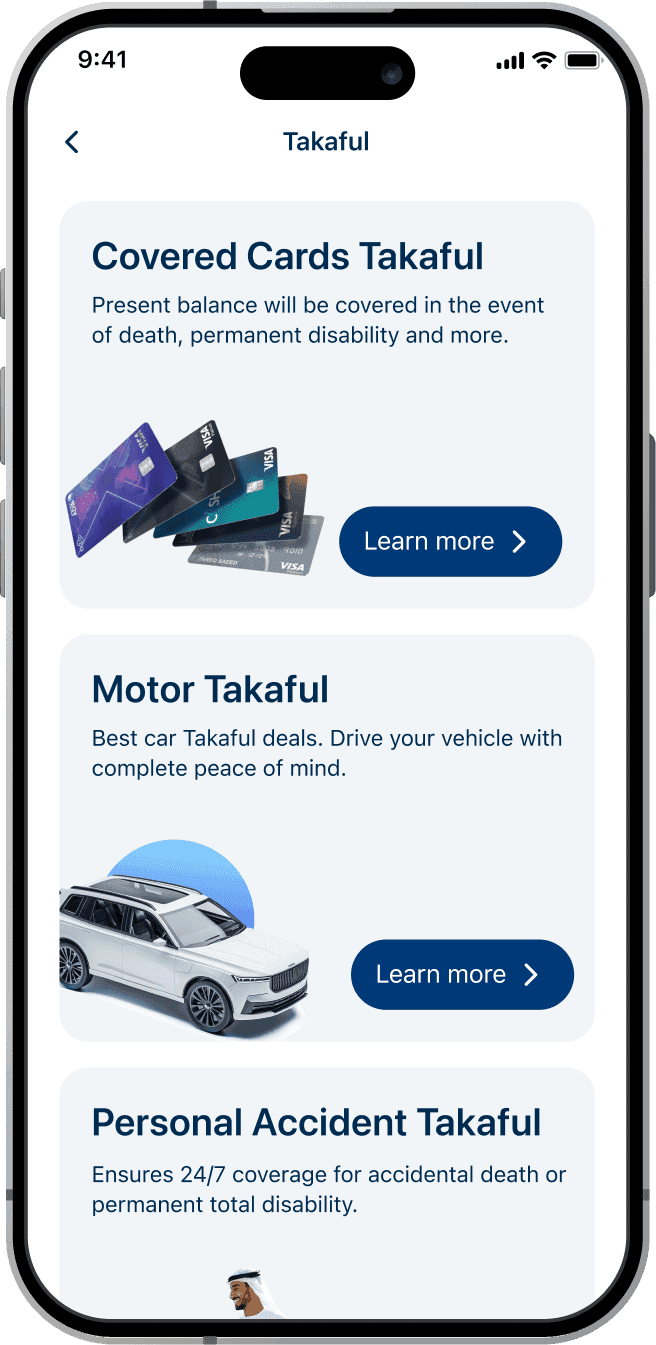
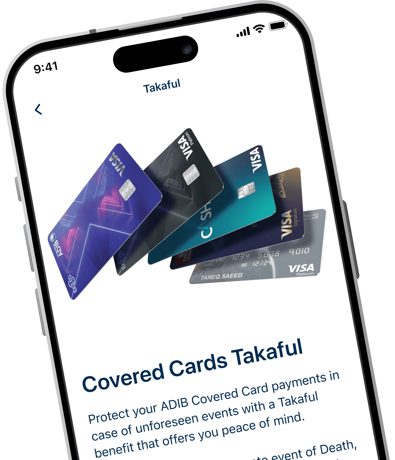
The real problem wasn't one journey. It was eight.
Rather than design each Takaful product from scratch, I partnered closely with the business and product teams to shape one journey pattern, built around the commercial goals, and productised it across every insurance type. One system, eight products, a fraction of the effort to ship and maintain each one. Of course, as always, with the best user experience in mind.
My process
Understand
I started by listening. User interviews surfaced where people were getting stuck, and Firebase analytics showed exactly where they dropped out. Studying how others in the market approached insurance gave me a benchmark for what good looked like.
Systematise and validate
Instead of designing eight journeys, I designed one and made sure it worked. Once the pattern held up in usability testing, each product became a case of tailoring it rather than starting over, with feedback shaping the pattern at every step.
Ship and optimise
I stayed close to the build, handing over design tokens, running design and dev reviews, and joining every agile ceremony. After launch I kept watching the real numbers, the drop-offs, the success rates, the integration failures, and kept refining the journeys as usage came in.
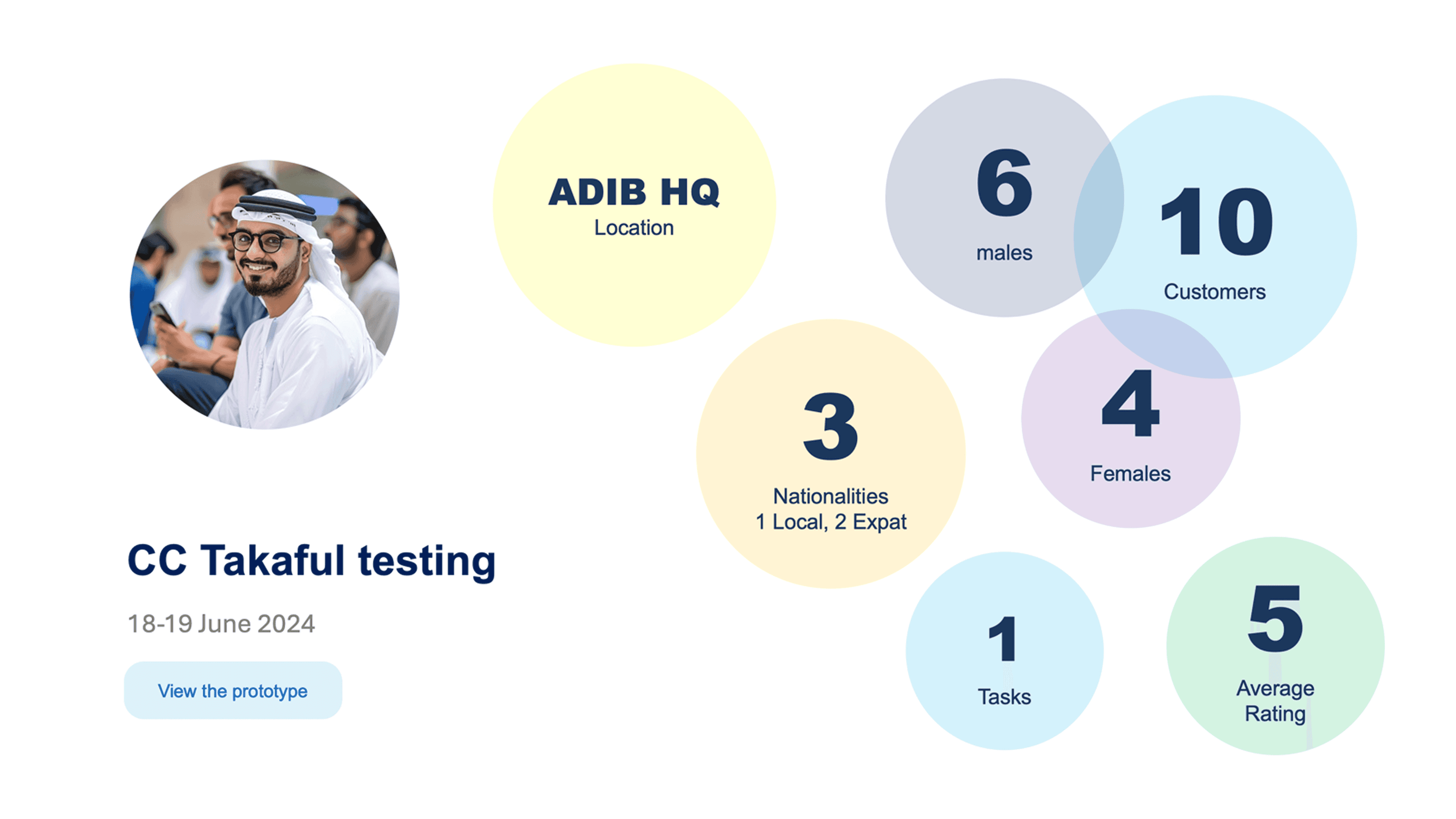
Customer feedback.

The process was very straight forward, I could complete the entire process in just a few clicks.

I found the journey intuitive, and the payment step was seamless. Everything was clear, and I felt confident making the purchase.

The feature is awesome, I would love to add this Takaful when I got my card.

The experience was smooth from start to finish. I appreciated how easy it was to review the policy details before confirming my purchase.

The design is clean, and I liked that I could complete the process in just a few steps.

The interface was simple, The only thing I would suggest is having an option to download the policy document immediately after payment instead of waiting for an email.

I found the journey very user-friendly, and everything worked smoothly. A minor improvement could be making the key benefits more prominent in the plan selection screen.
Conclusion
Before this, there was no proper digital way to take out Takaful, just a broken web flow. I built the in-app experience from scratch and turned it into a system: eight products from a single journey pattern, sales up 650%, and operational workload down 65%. For the first time, customers had a simple, consistent way to get the cover they needed.
- Project
- Design System
Challenge
ADIB's product spanned iOS, Android and web, and mobile alone had multiple teams building in parallel. That's where design systems usually fall apart: without a shared source of truth, every team drifts, the same component gets rebuilt three slightly different ways, and tokens diverge until the platforms stop looking like the same bank. We needed every team building the same components from the same tokens, and we needed a way to actually enforce that, not just hope for it.
Results
I built, governed and documented the design system behind ADIB's banking apps, and made it the single source of truth engineering built from. To hold quality across iOS, Android and web, I introduced a design review policy and process that enforced every team building from the same components and tokens.
- Components
- 109
- Design tokens
- 108
- Brand themes
- 5
- Platforms
- 3





Platform typography
iOS and Android use their platforms' own system typefaces rather than a custom face. That kept implementation simple, gave every user the accessibility they already expect from their own device's text-size settings, and meant no font licensing or updates to manage, while still holding the bank's visual direction. Web carries that same direction through Bliss Pro.
- iOS
- SF Pro Display
- Android
- Roboto
- Web
- Bliss Pro
Color system
Every token in the system (background, text, buttons, error, success, warning, info) stays exactly the same across ADIB's four customer tiers. Only two tokens actually change: segment.accent and segment.surface. Swapping just those two re-skins the whole experience per tier, without touching anything else.
- Mass
- Accent
#0EA4DF - Surface
#EEF7FB - Gold
- Accent
#94703D - Surface
#F2F5F7 - Private
- Accent
#A98450 - Surface
#000000 - Diamond
- Accent
#333333 - Surface
#F2F5F7